
Iranol
Iranol is a top company in Iran’s lubricant and petrochemical industry, recognized for its innovation, quality products, and strong distribution. To help Iranol grow in both B2B and B2C markets, we redesigned their logo to show their forward-thinking values and heritage. We also created a clear brand strategy to keep visuals and messaging consistent everywhere. Our targeted marketing for key industries highlighted Iranol’s product strengths and focus on sustainability. These steps improved Iranol’s brand image, market status, and relationships with customers and partners.
Logo Redesign | Brand Strategy | Visual Identity
Client
Iranol Oil Company
Year
2023
Starting Point:
Understanding
the Brand
Before any design work began, the studio conducted a deep review of Iranol’s history. Iranol originated as a subsidiary of the National Iranian Oil Company and became an independent company in 2002 (1381 SH). This industrial heritage and historical credibility became the foundation for every design decision a rebrand must honor a brand’s roots, not erase them.
Comparative
Research
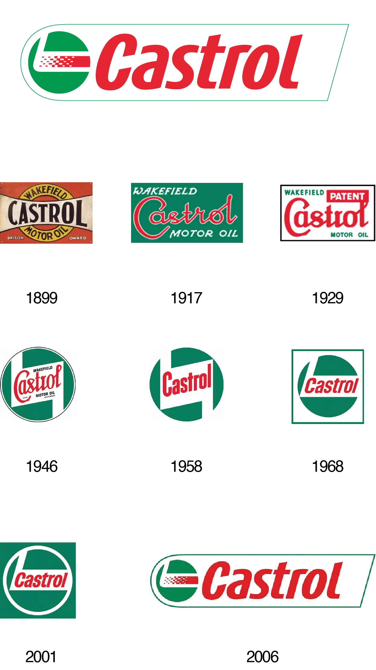
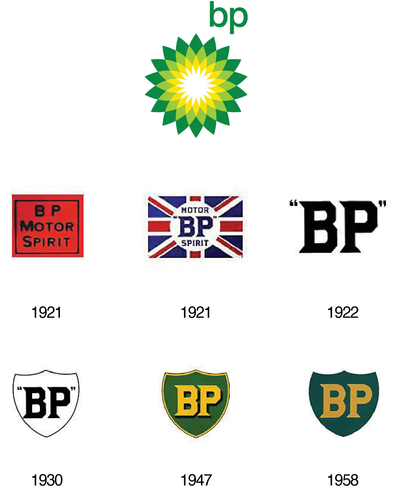
To understand how logo evolution works in comparable industries, the studio studied the visual evolution of major global oil and lubricant brands.This research confirmed that rebranding is a marketing strategy in which a symbol, design, or concept changes to present a renewed identity to customers, investors, and competitors without necessarily discarding the brand’s core heritage.
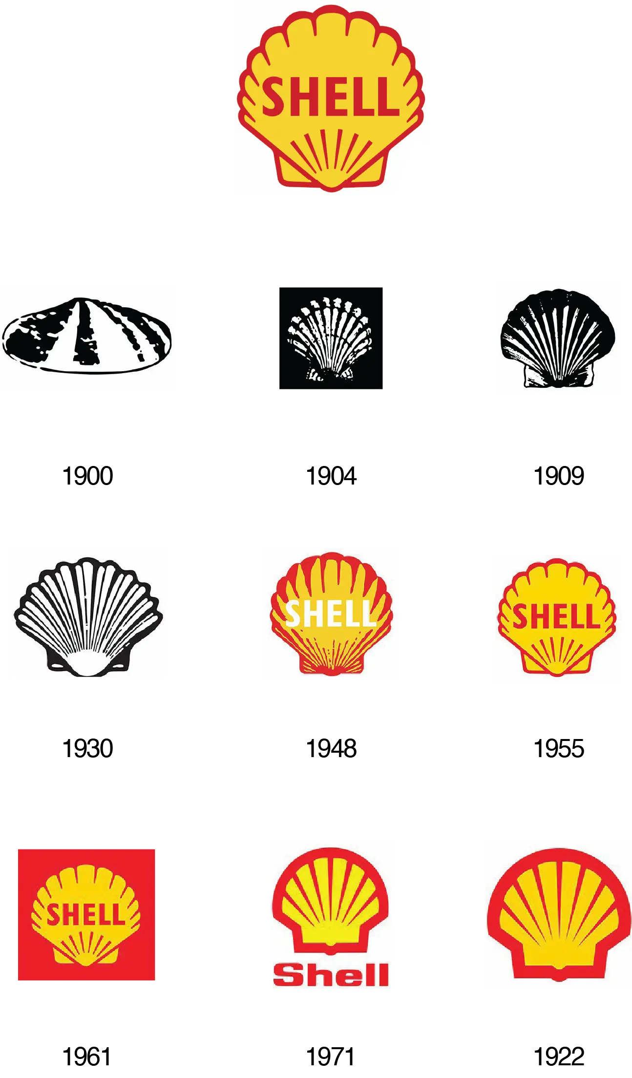
Shell from the 1900 linear scallop to today’s flat, modern shell
BP from the 1958 green shield to today’s sunflower symbol (2000)
Castrol from the 1968 classic badge to today’s simplified green wordmark
Defining the Brand Archetype
Before any visual direction was chosen, the brand’s personality was defined first. This step went beyond color or typography it answered a single question: what kind of character is Iranol, and how does it speak to its audience?
The archetype selected for Iranol was The Caregiver:
Core belief: “Love your neighbour as yourself”
Goal: To help and matter to others
Brand tone: Considerate, thoughtful, kind,generous
Emotional impact on the audience: Feeling cared for, protected, and safe
Brand fear: Selfishness and ingratitude
This archetype aligned naturally with Iranol’s product itself oil that protects engines and extends the life of machinery. Much like a caregiver who acts before a problem occurs, Iranol positions itself as a protective, life extending presence for its customers.
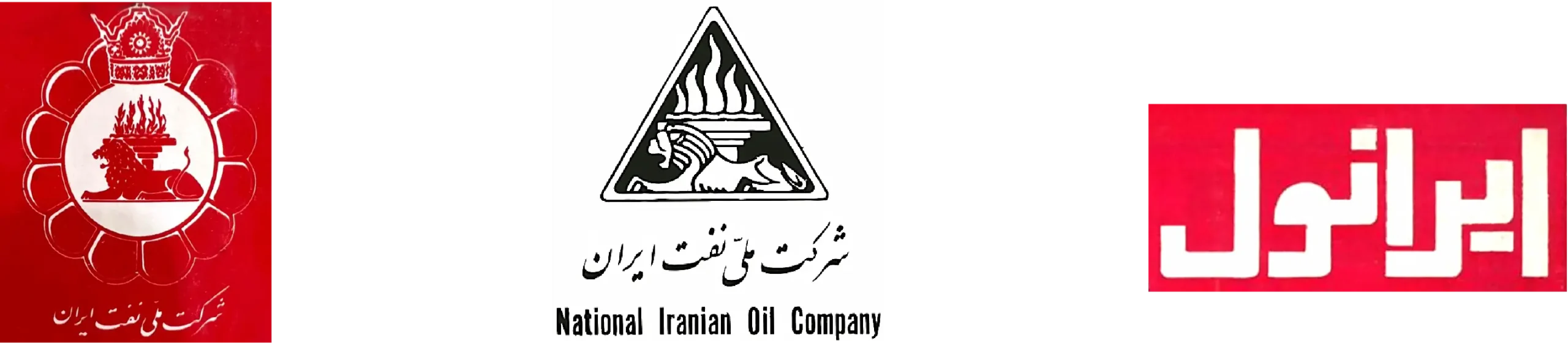
Iranol's Logo Timeline
To make an informed design decision, the full history of the Iranol mark was reviewed:
Designing the New Mark
Two guiding principles shaped the new logo: keeping pace with today’s fast-moving world, and maintaining a visual link to the previous mark, so the transition feels natural and continuous rather than a break in identity.
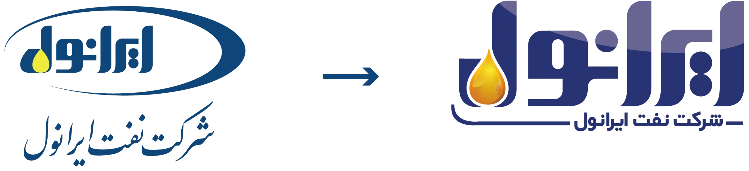
Key design decisions:
Emphasizing the oil drop and its container as the mark’s central conceptual element
Removing the surrounding oval frame for a lighter, more contemporary form
Replacing the previous generic font with custom typography built to match the structure of the mark itself
Shaping the Persian letter “ل” (L) as a vessel from which the drop falls merging wordmark and symbol into a single cohesive form
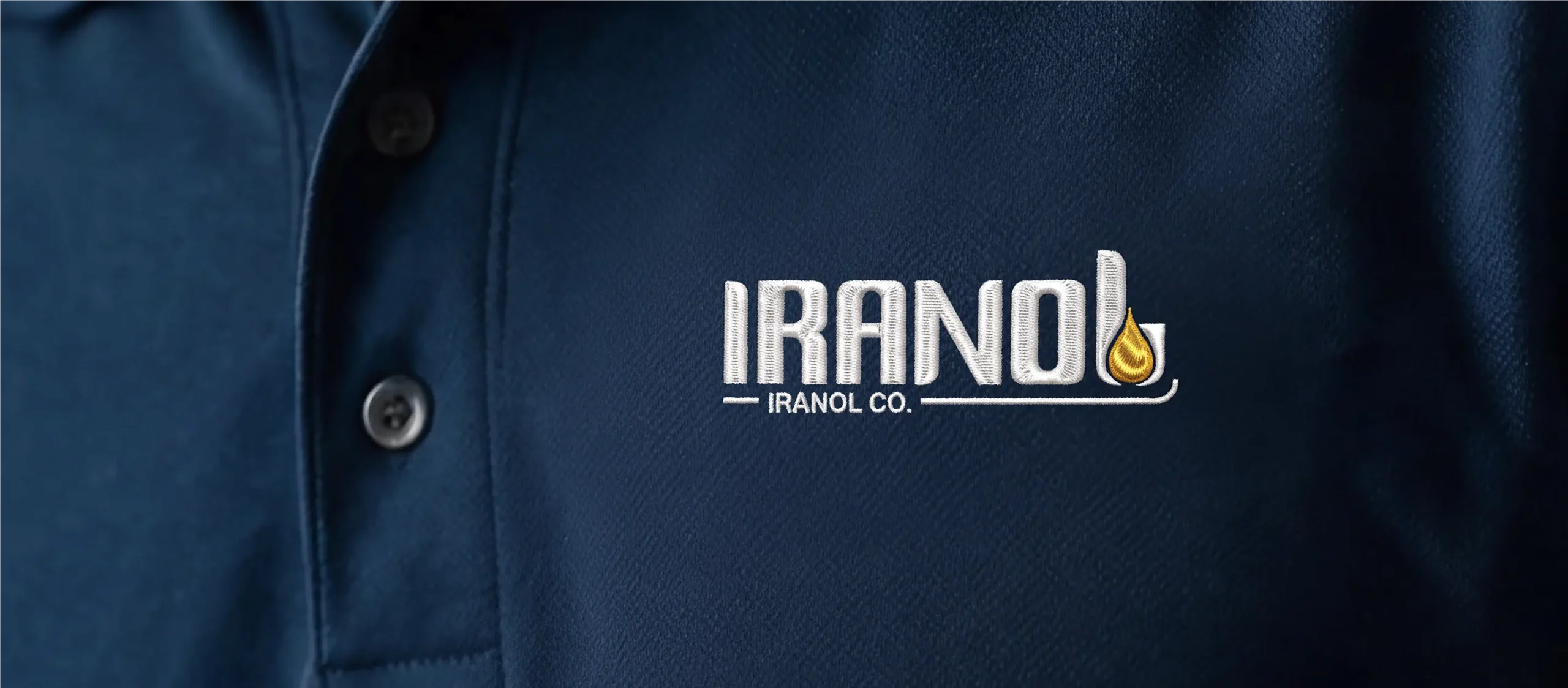
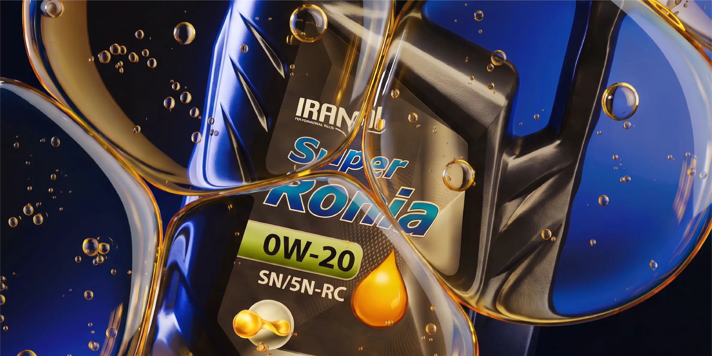
The result is a mark that feels modern, current, and trustworthy, while remaining rooted in Iranol’s historical identity.
Logo
Structure &
Responsive
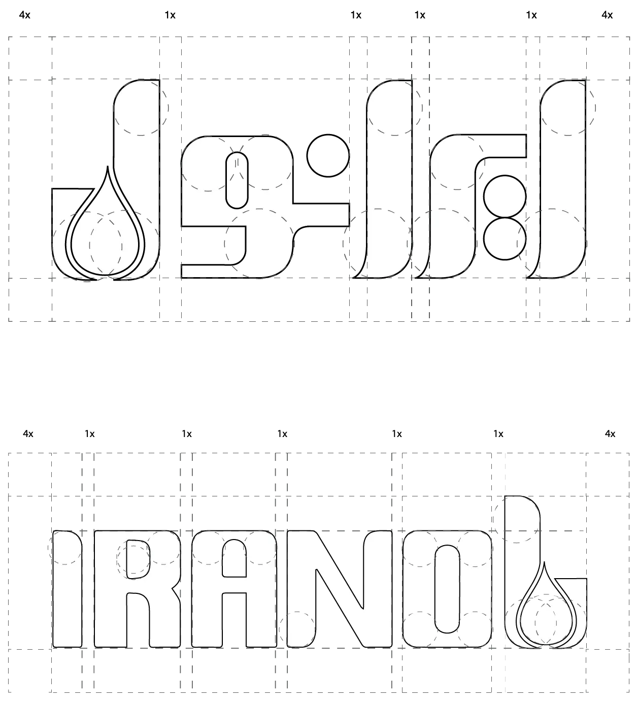
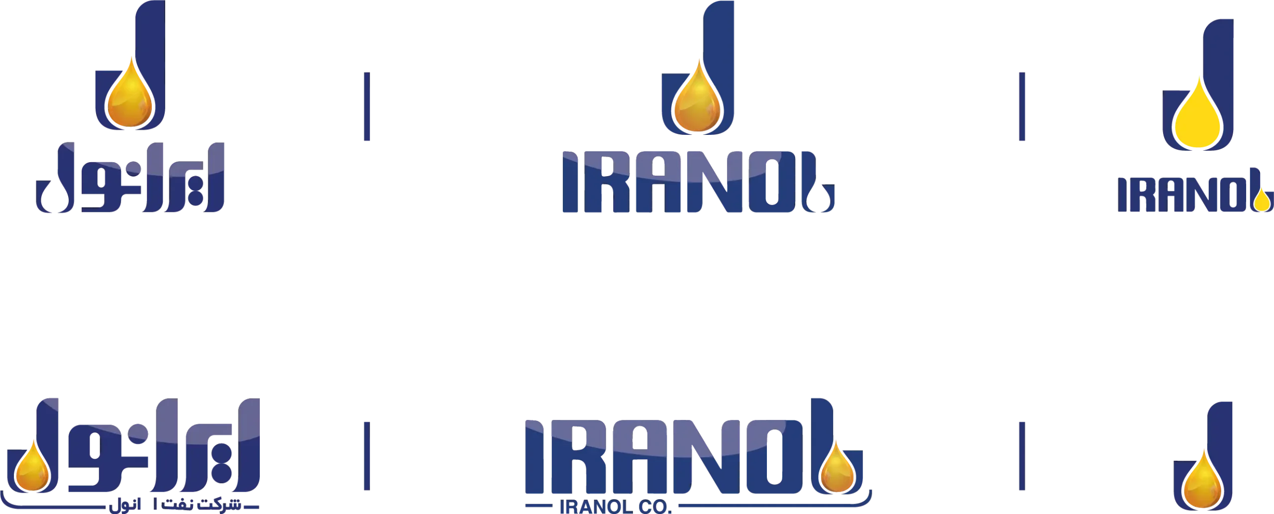
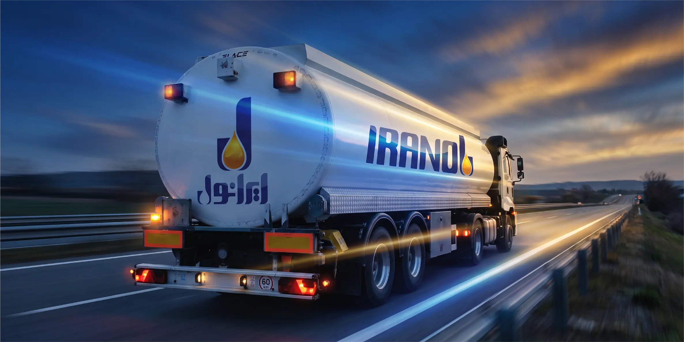
The mark was built on a defined grid (4x/1x proportional units across the letterforms) to preserve consistent proportions in every application. A responsive logo system was also developed full lockup, horizontal wordmark, and standalone symbol for use across vastly different formats, from a large station header to a printed pen; a similar approach to how brands like Google, Heineken, Walmart, and Aston Martin adapt their marks across contexts.
Team
Art Director & Brand Strategist: Taha Zaker
Graphic Designers: Shaghayegh Shirzad, Maryam PirAli
Motion Design: Hesam Saleh Beig
Portfolio & Presentation Designer: Tanin Amin