Ghadir Holding
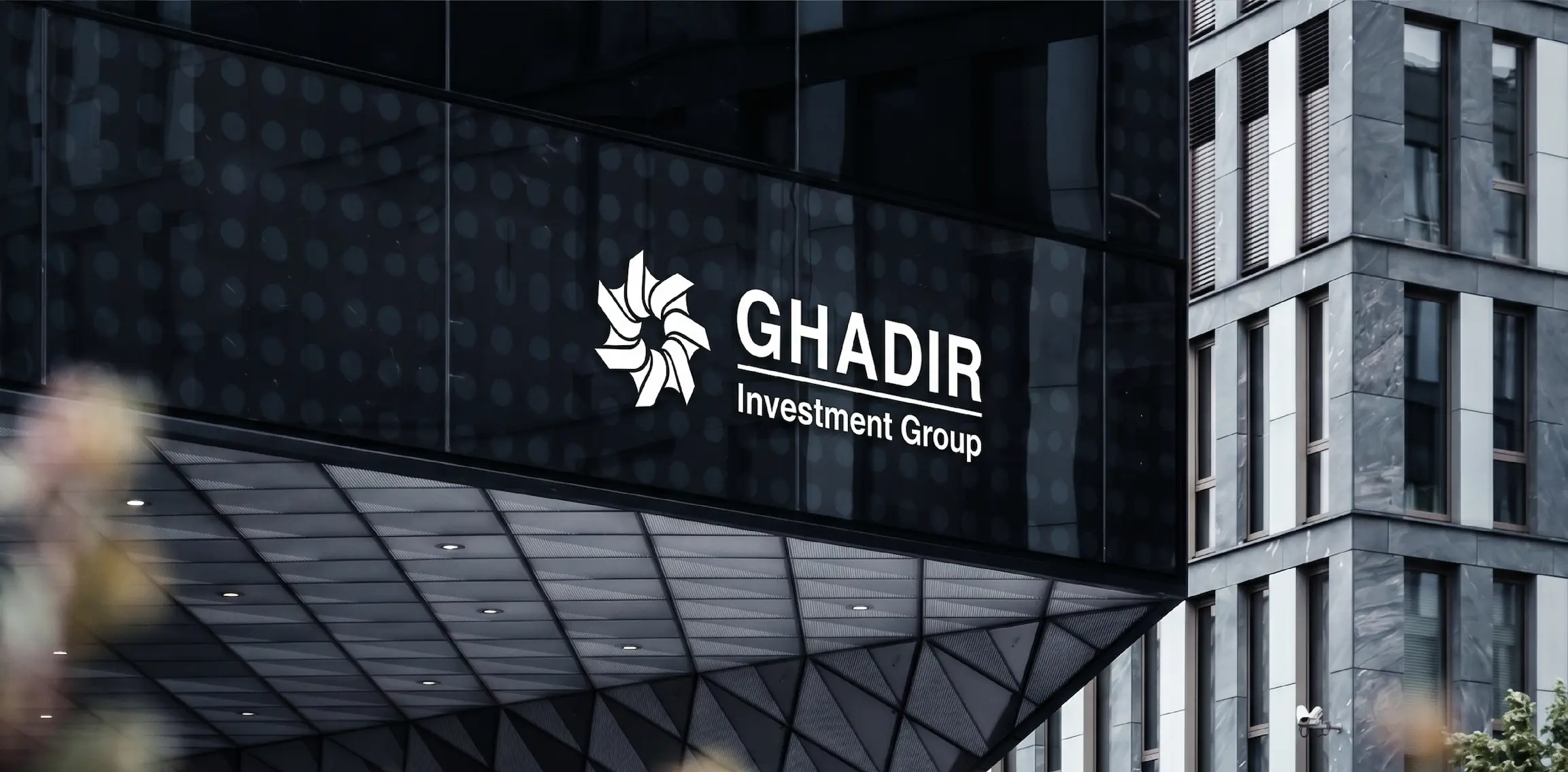
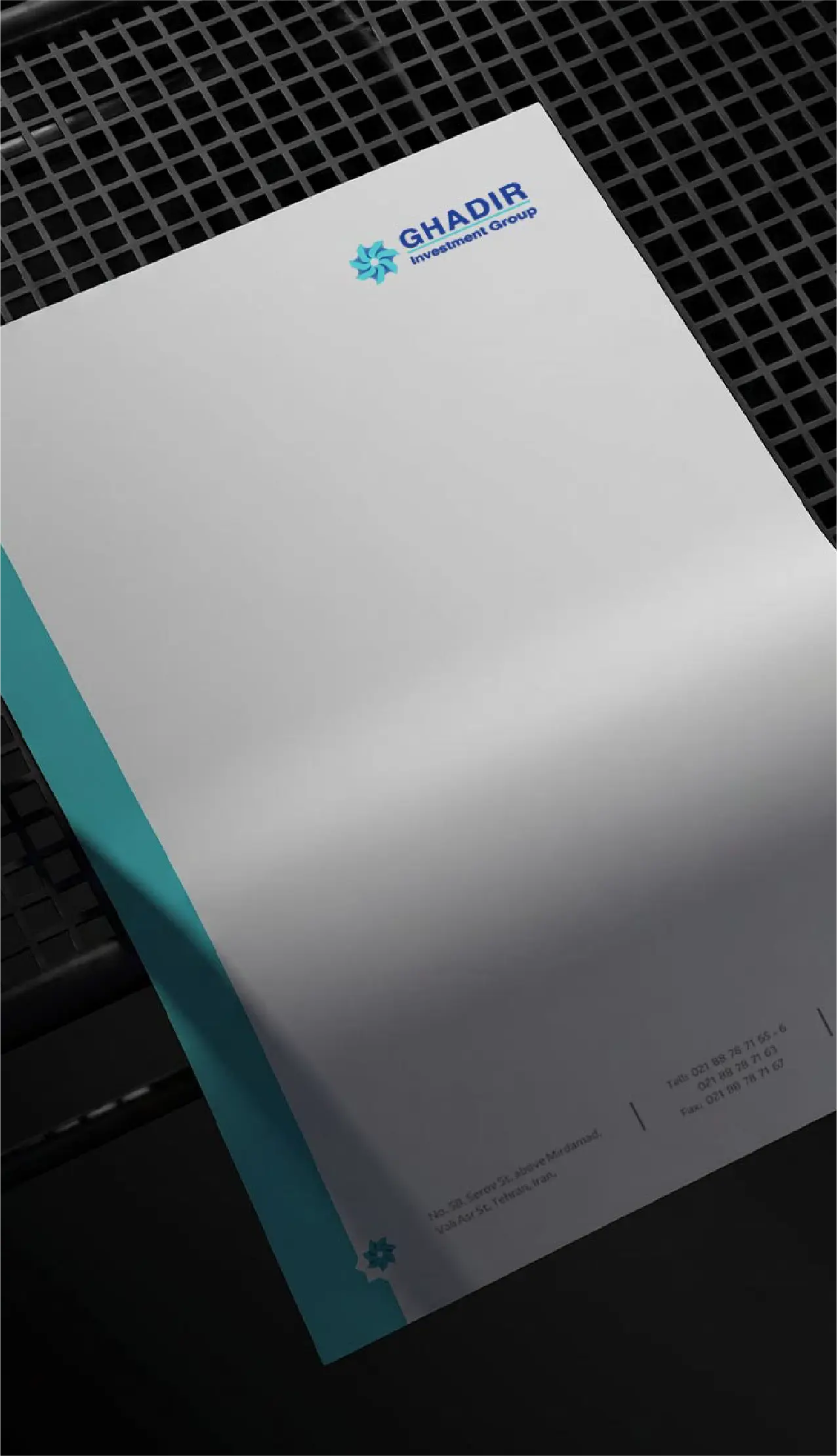
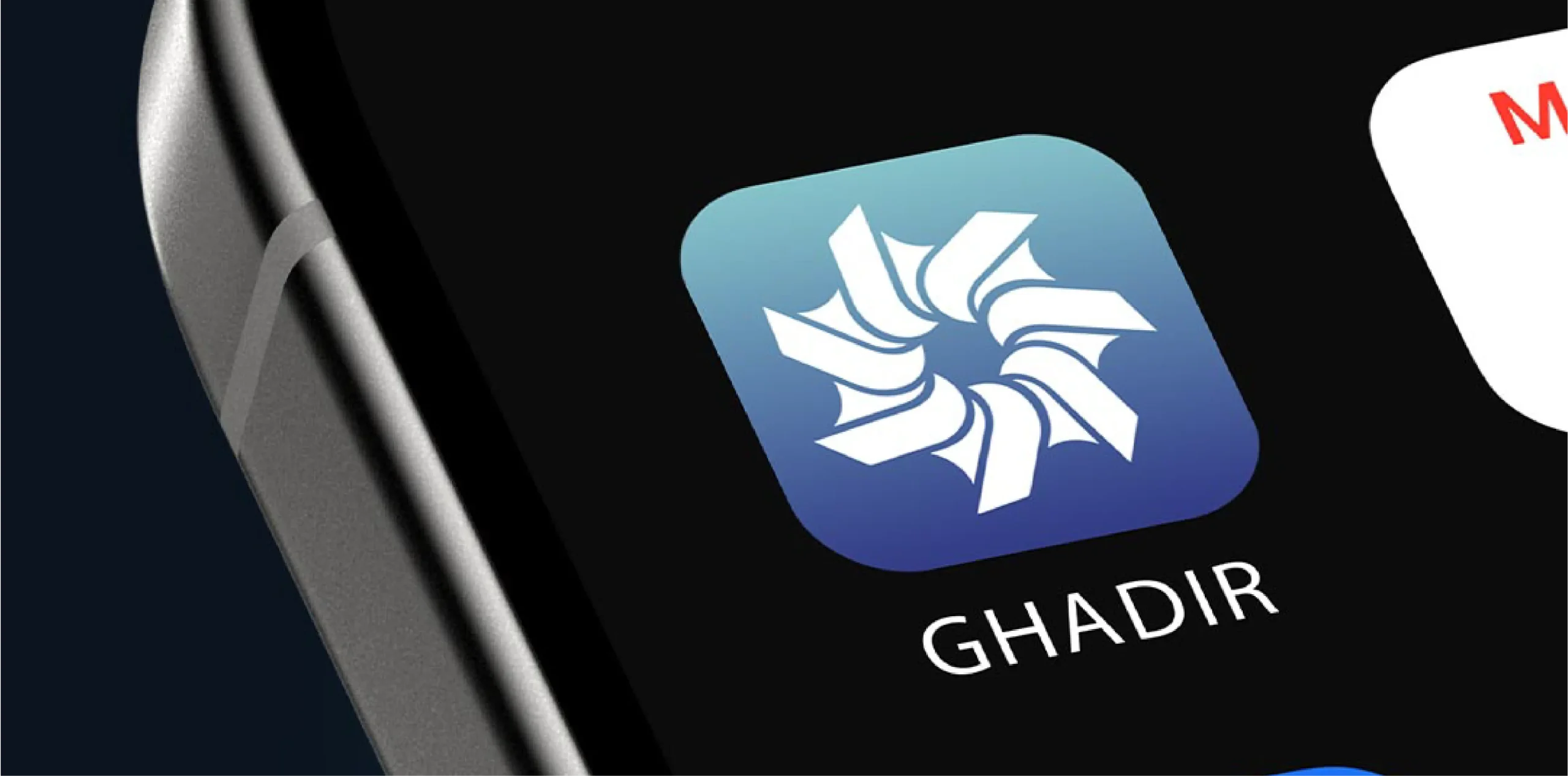
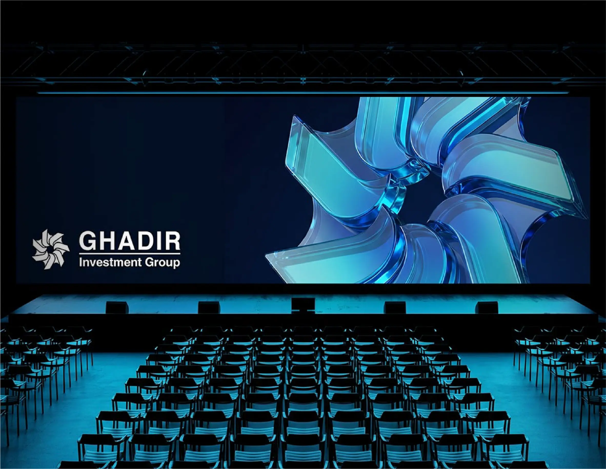
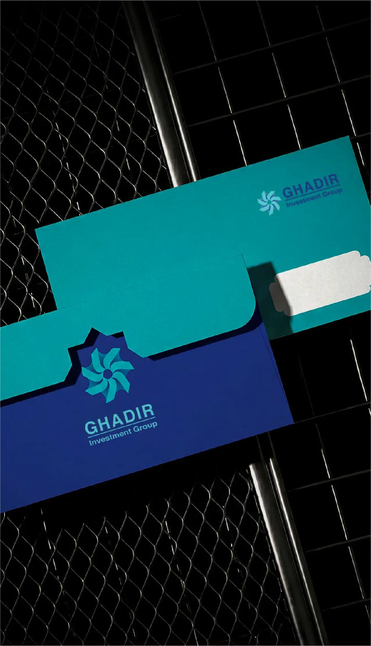
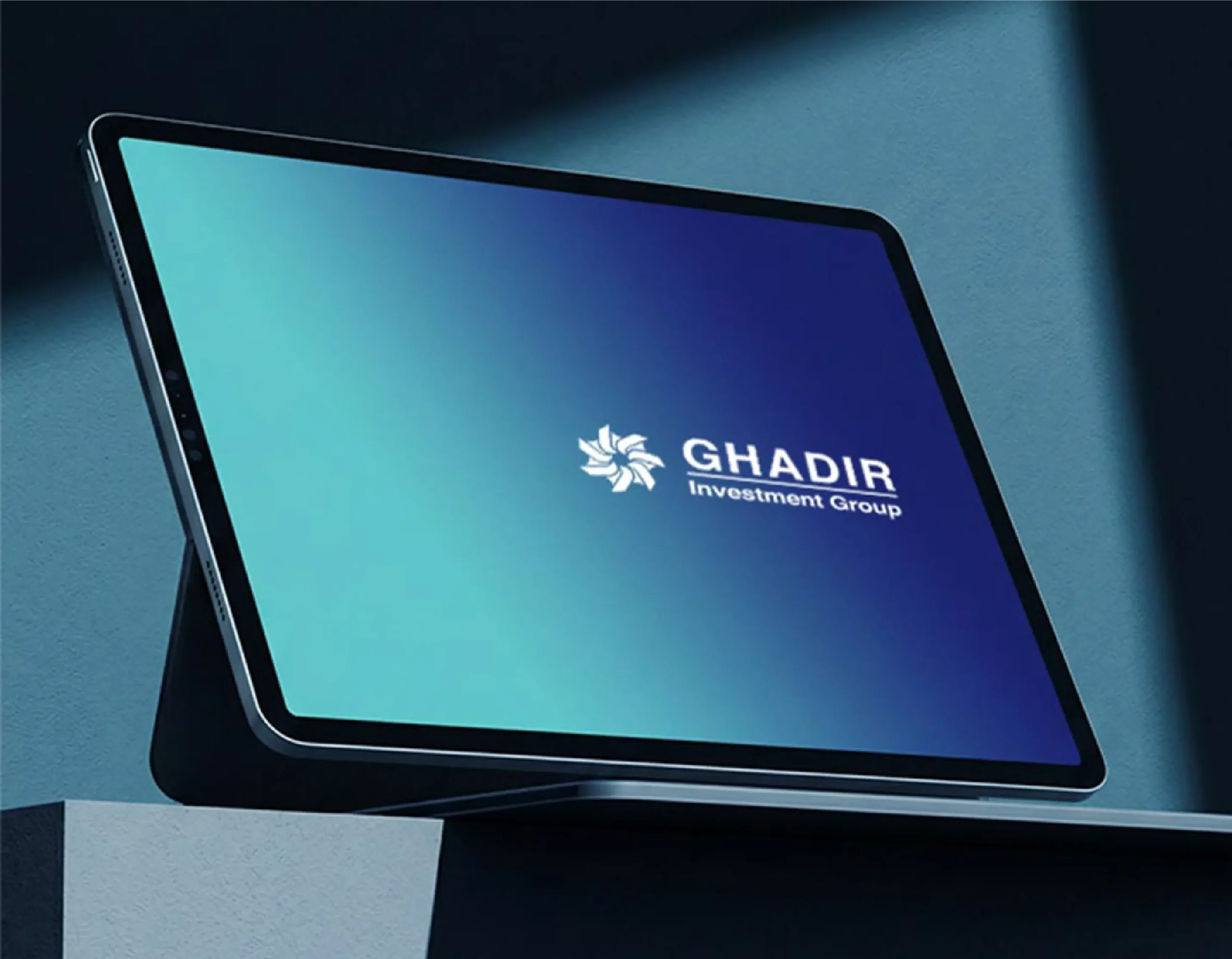
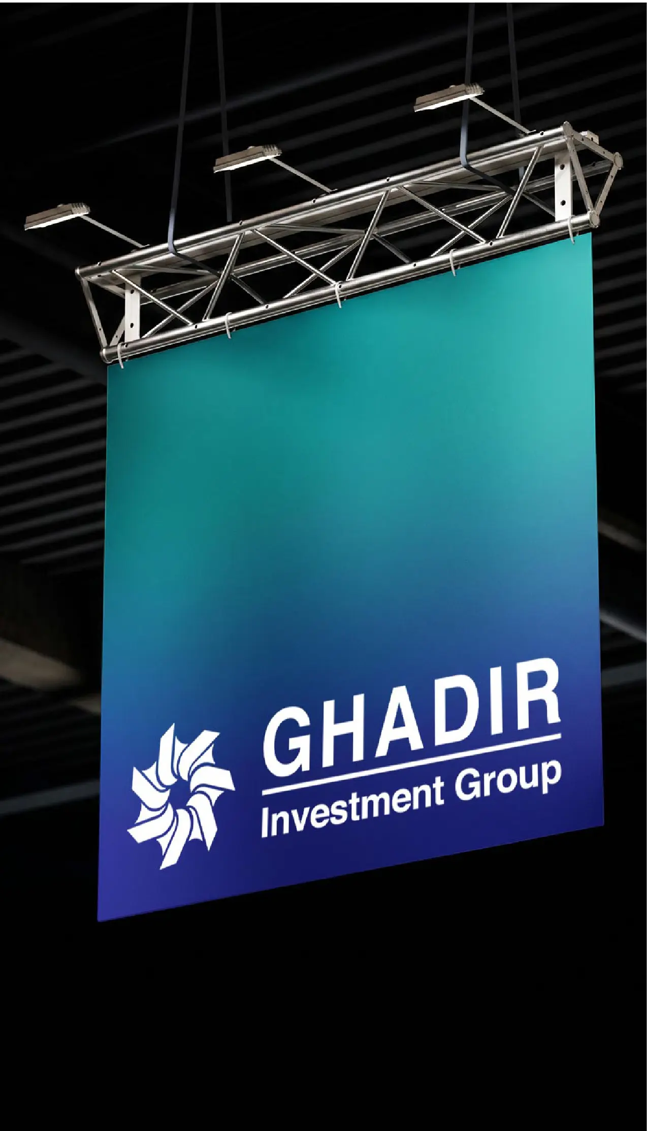
Ghadir Holding is a leading diversified investment group with major interests in energy, industry, finance, and infrastructure. As one of Iran’s most influential conglomerates, it plays a key role in influencing the national economy and leading strategic investments. Our cooperation included a multi-phase branding project, executed through several key stages. The project began with a thorough discovery phase, including research into Ghadir’s market position and stakeholder interviews. Based on these insights, we moved to the concept development phase, where we created and refined the new brand direction and visual elements. This was followed by the design phase, which created a distinctive logo that reflects unity, growth, and an innovative vision. Finally, we developed a comprehensive brand book with clear visual and verbal guidelines, covering color palettes, typography, tone of voice, and messaging principles. This structured approach ensures a consistent brand presence across all business units and communications. The unified identity strengthens Ghadir Holding’s reputation for leadership, innovation, and trust in a dynamic marketplace.
Logo Redesign | Brand Book
Client
Negin kish
Year
2024

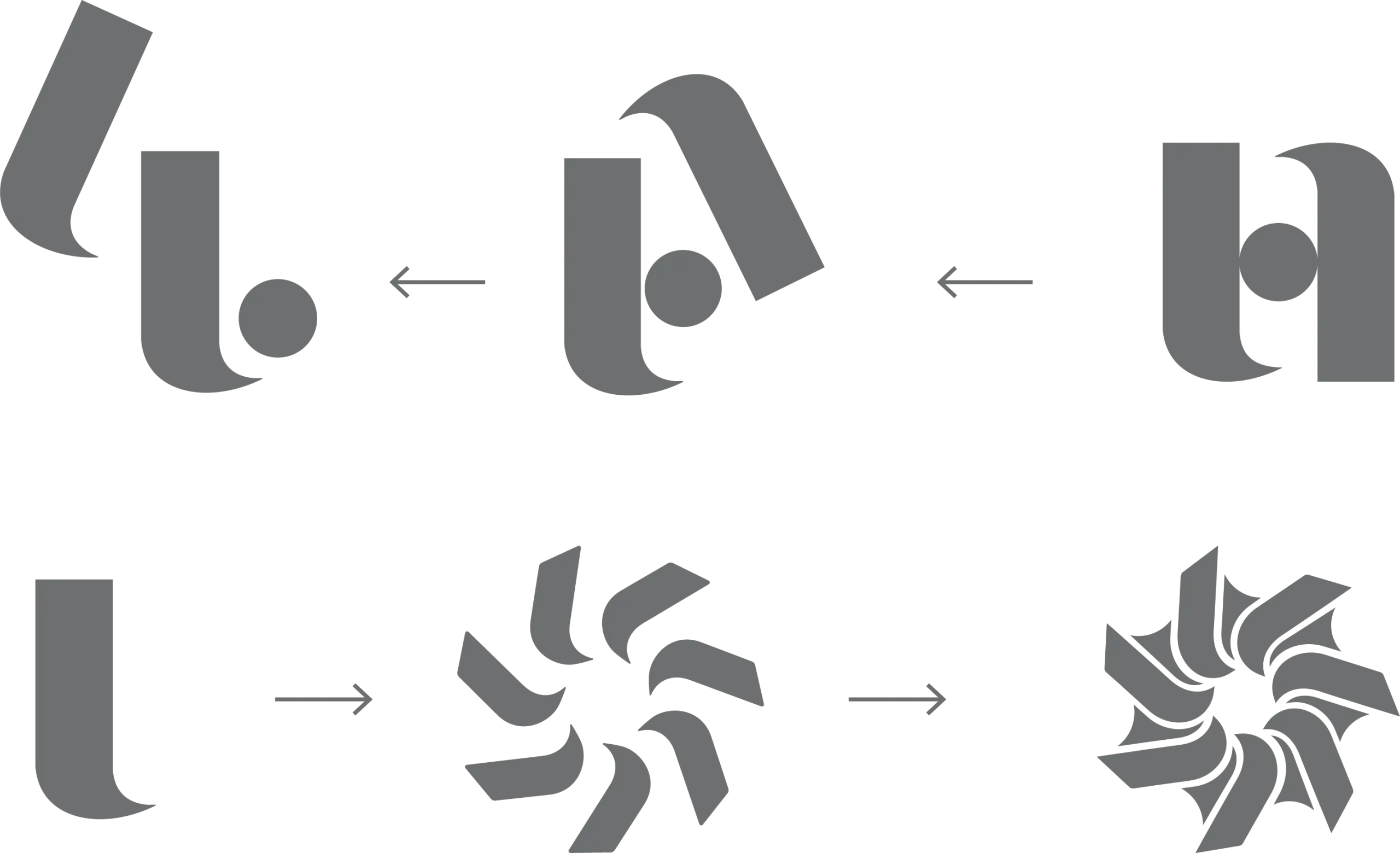
Logo Progression
The primary mark of Bank Saderat Iran was born from the synthesis of two distinct visual concepts, each carrying deliberate symbolic meaning.
The first is a pair of hands holding a coin, a visual metaphor for trust, protection, and financial stewardship. The open, sheltering gesture shows the bank’s role as a safe custodian of its clients’ assets.

The second is the universal symbol for import and export: a globe encircled by two arrows moving in opposing directions. This element directly reflects the institution’s name and core function — Saderat, meaning “exports” — positioning the bank within the context of international trade and commerce.
The Conceptual Origins of the Bank Saderat Iran Mark
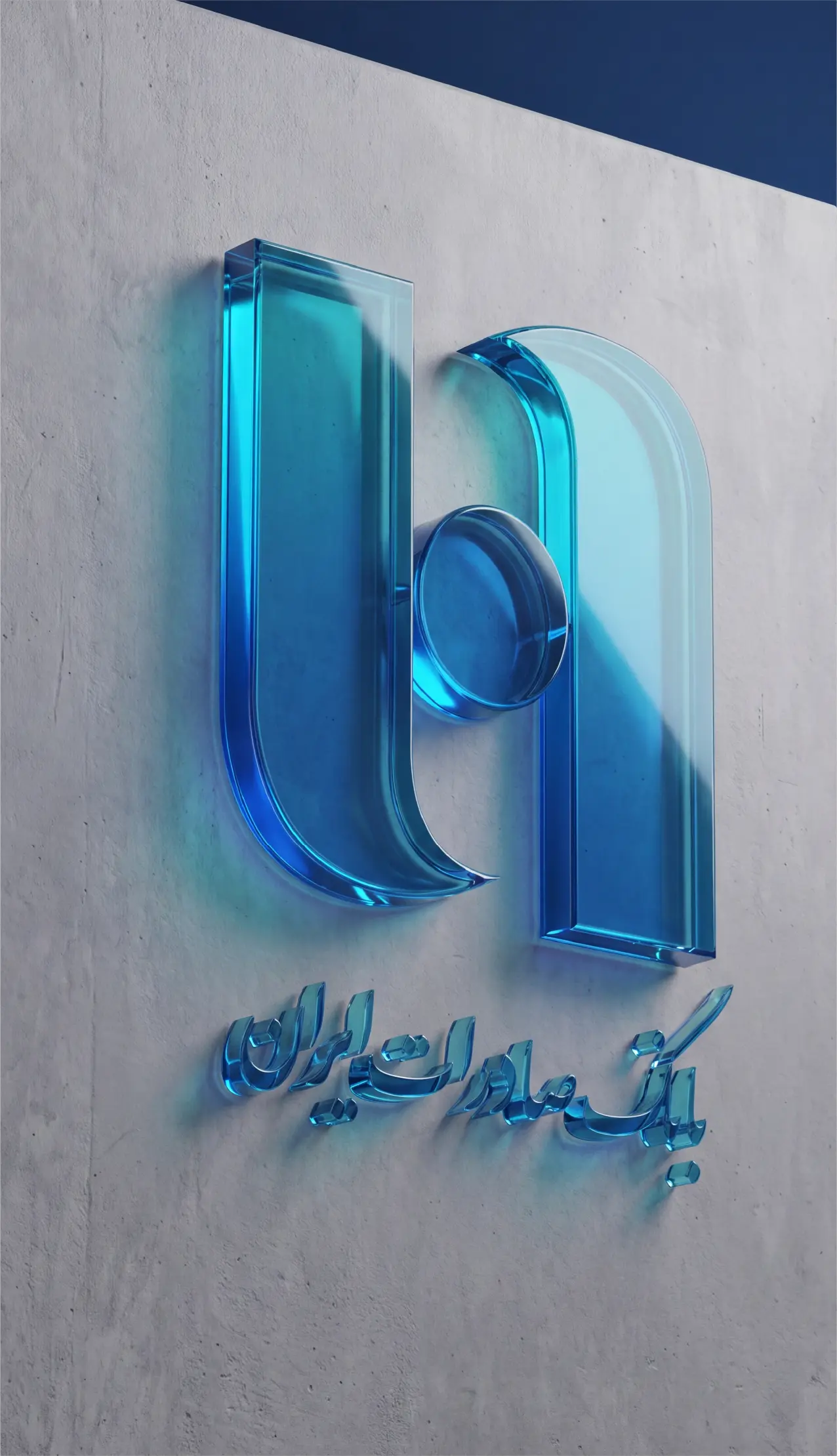
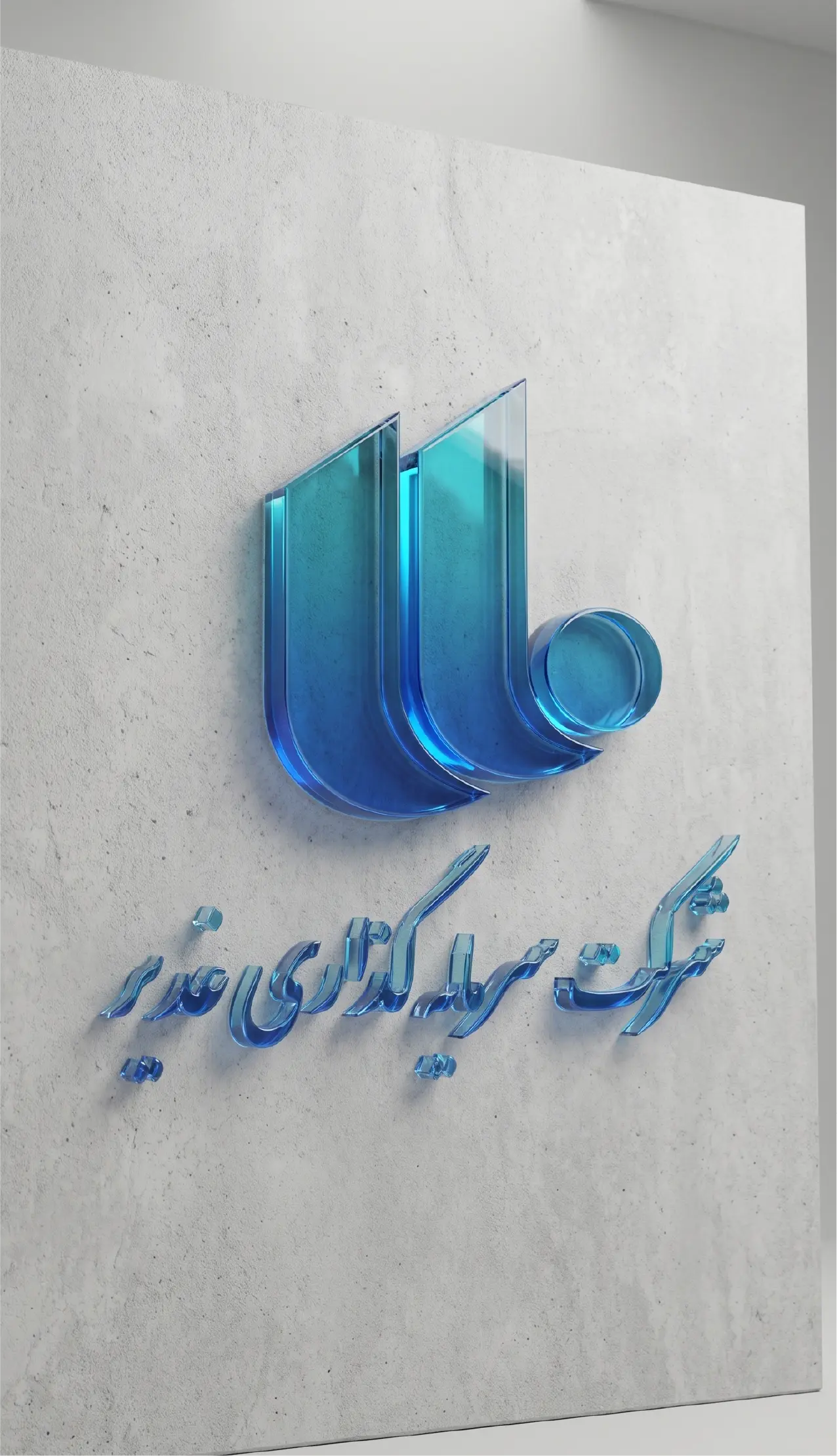
These two concepts were fused into a single abstract monogram paired with the Persian wordmark “Bank Saderat Iran” in a flowing, calligraphic script. Visually, the open hands are shaped to also suggest the curves of the two arrows, while the coin is placed at the center, doubling as the globe. The hands and arrows together form an embracing, circular frame around the central coin-globe, blending the ideas of protection and global exchange. The result is a mark that reads as both a trust symbol and a trade symbol, encapsulating the bank’s combined identity.

Team
Art Director: Taha Zaker
Logo & Visual Identity Designer: Maryam Afravi
Portfolio & Presentation Designer: Tanin Amin