
House of WARAG
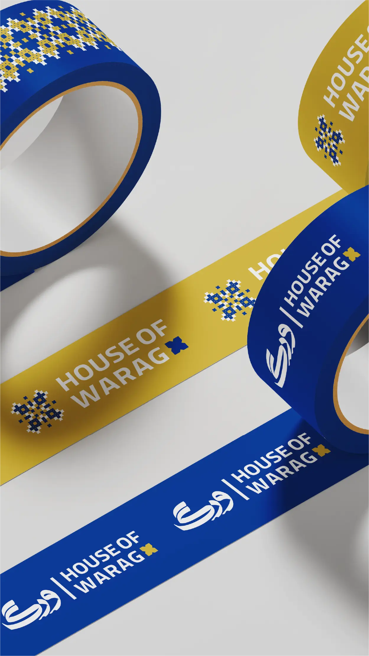
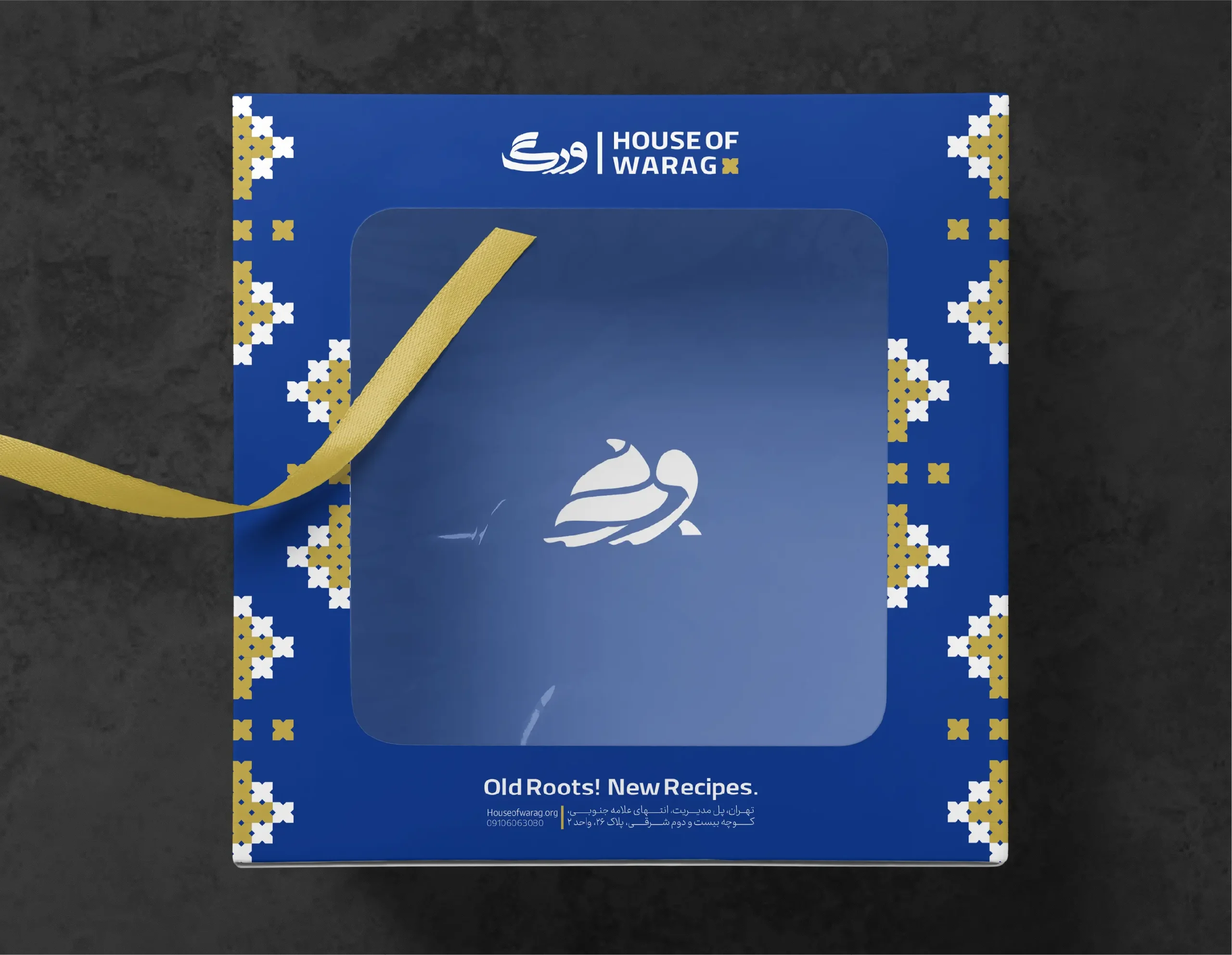
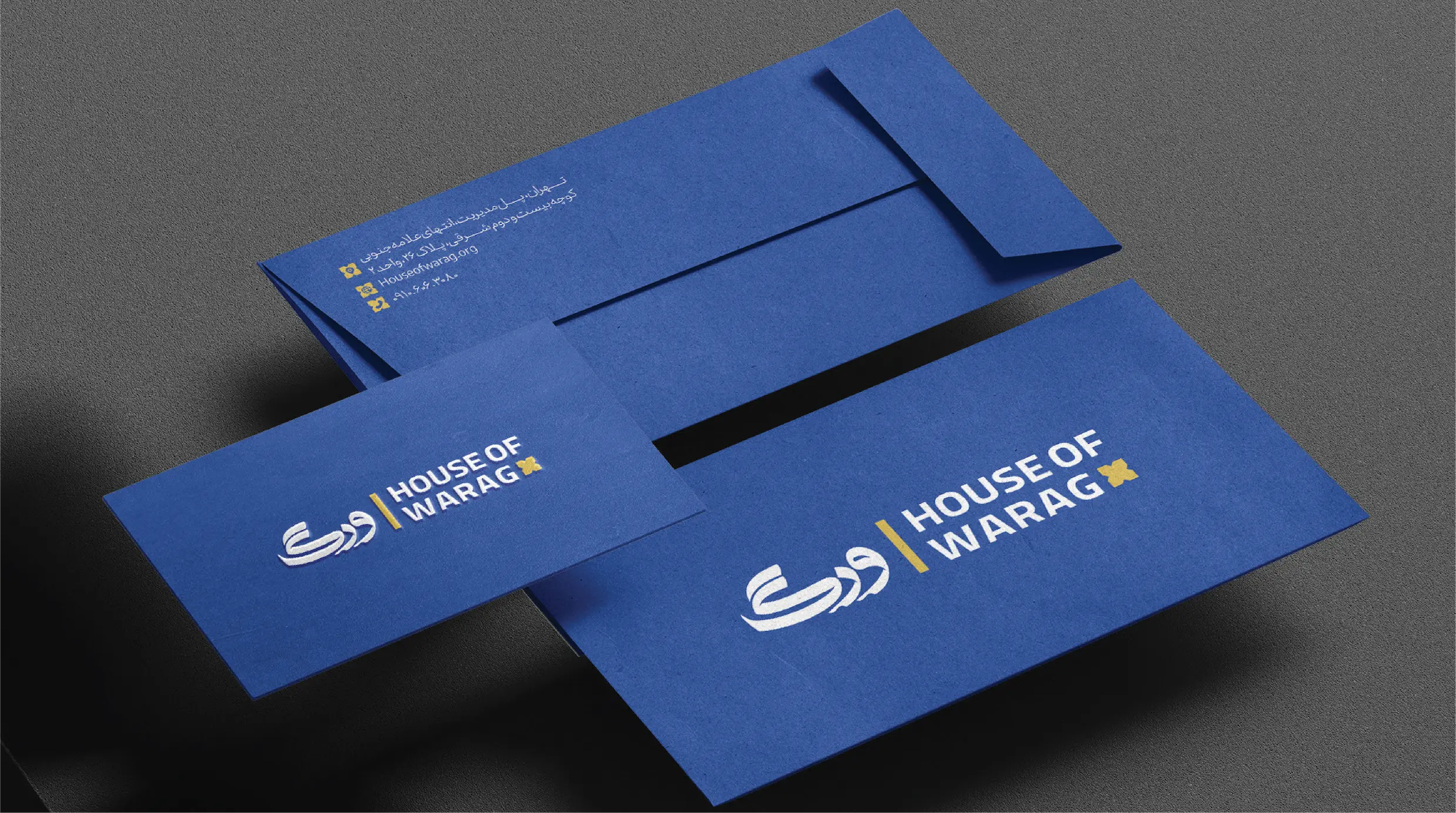
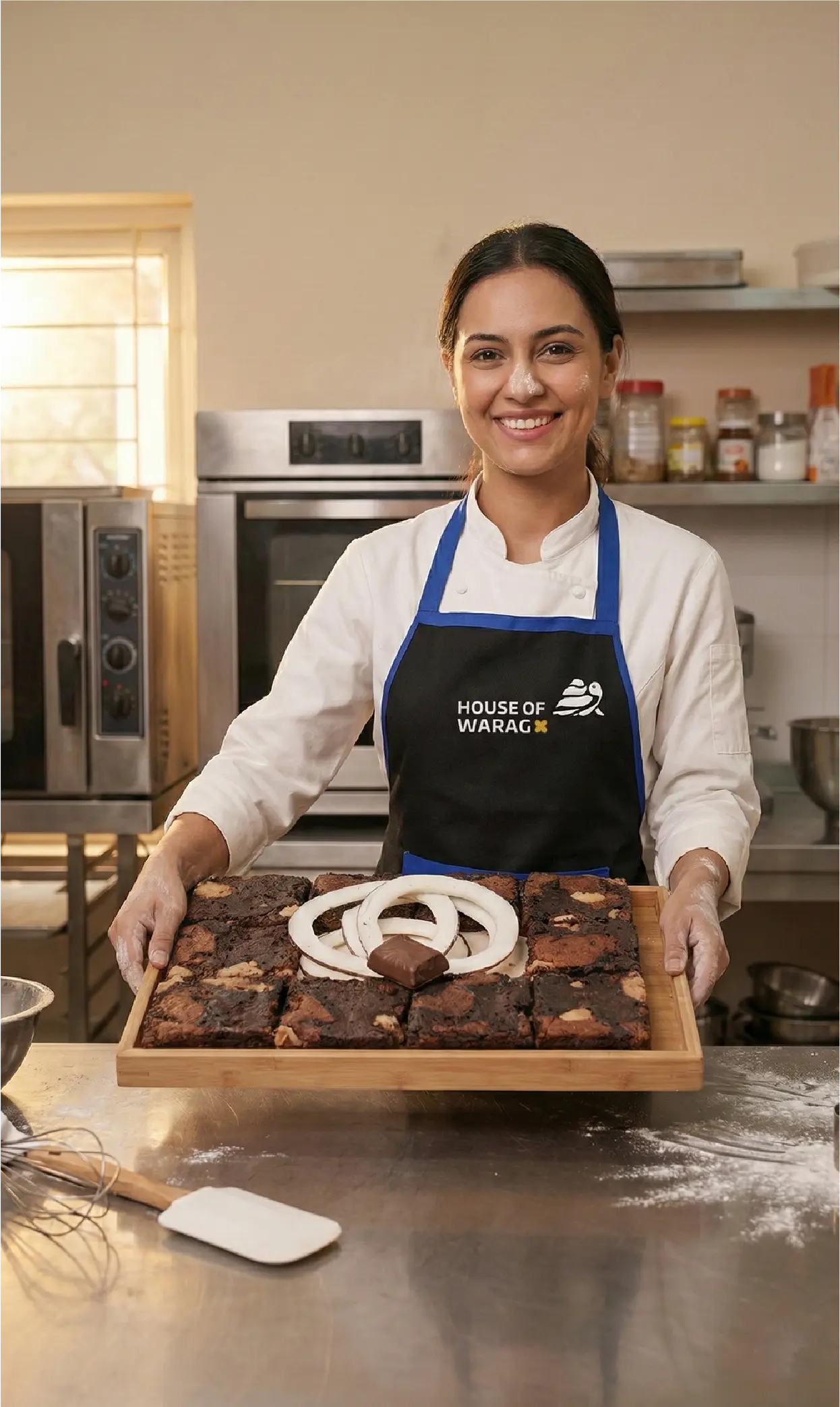
House of WARAG features local products from Iran’s Sistan and Baluchestan region, distributing handicrafts and food products nationwide. WARAG represents more than a gastronomic creation; it reflects the spirit of Baluchestan and connects its heritage with the future. We developed the brand’s logo, visual identity, and mascot to express this cultural narrative. This approach gives House of WARAG a unique position in the market by highlighting authentic regional roots and a strong devotion to heritage. By weaving these cultural elements into the brand’s visual language, we help WARAG stand out among competitors and create a closer connection with customers who value authenticity, quality, and meaningful storytelling.
Brand Strategy | Logo | Visual Identity | Mascot Design | Motion Logo
Client
Rosten Holding
Year
2024
Logo Concept
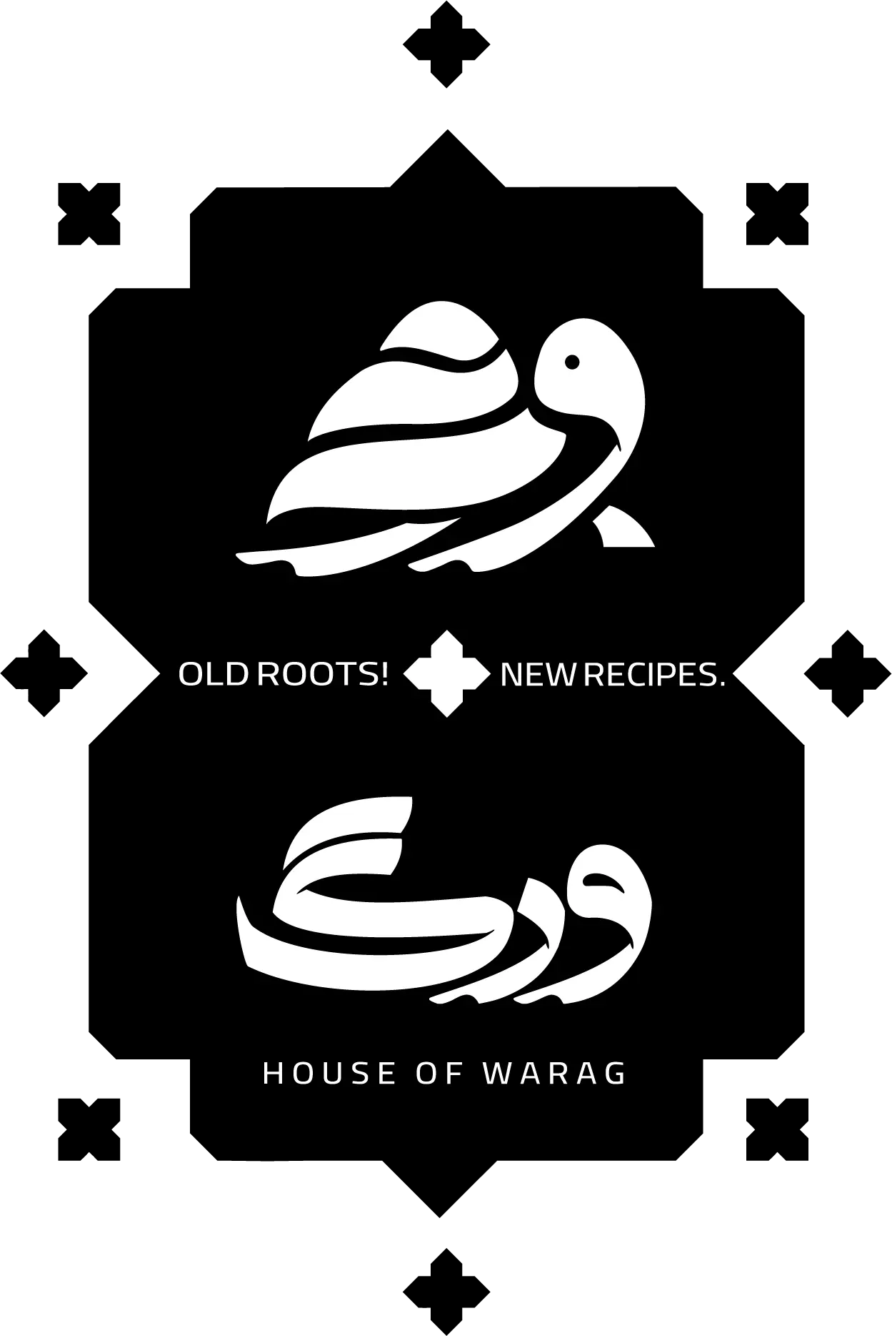
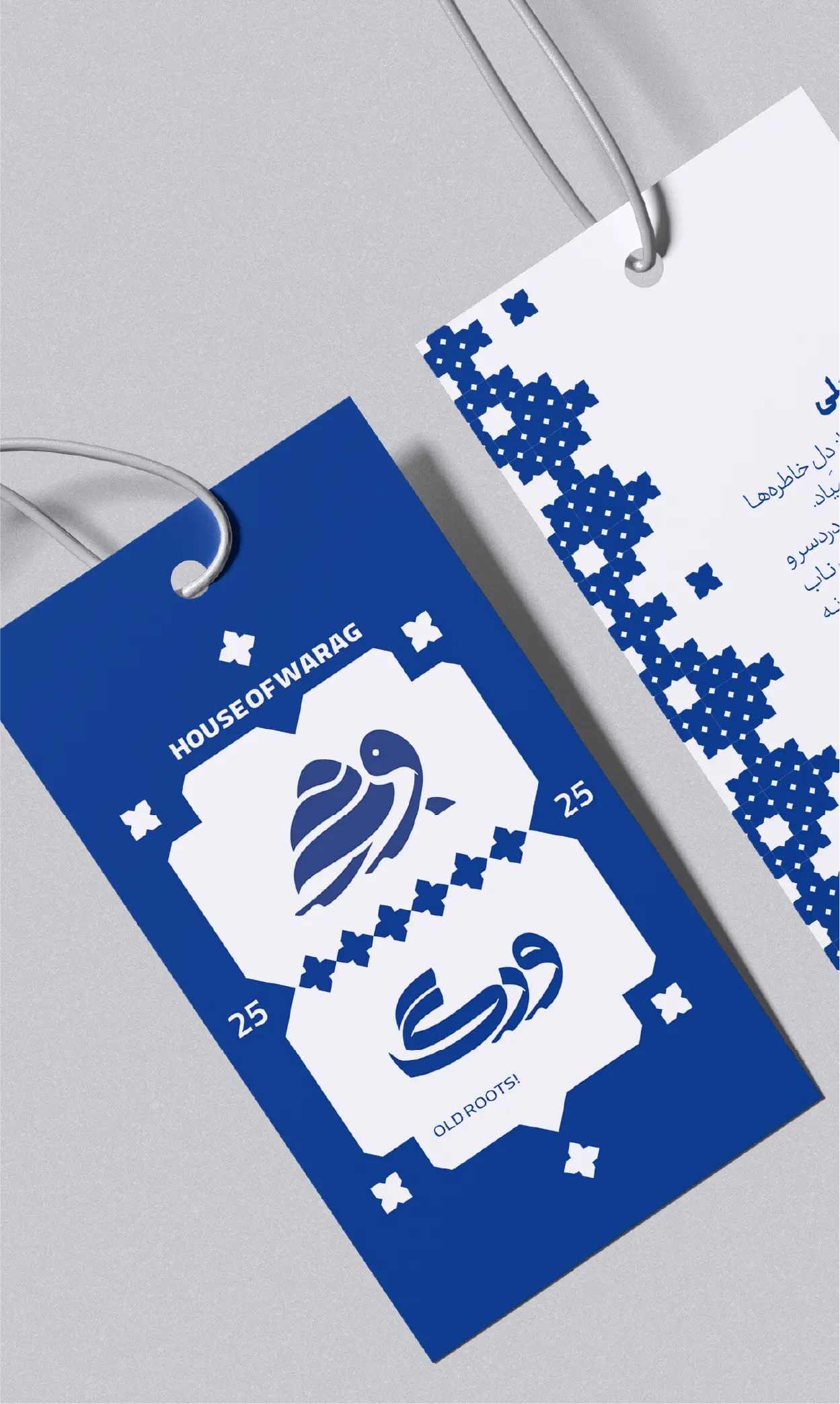
The House of WARAG logo features the silhouette of a turtle, intentionally referencing a native Baluchestan species now threatened with extinction. By choosing the turtle, the brand is consistent with the values of stewardship and deep respect for both culture and the environment, paralleling the client’s mission to preserve and promote the region’s rich heritage. This design works as both a visual identifier and a subtle statement of cultural and ecological awareness, reinforcing WARAG’s purpose and devotion to safeguarding tradition for future generations.
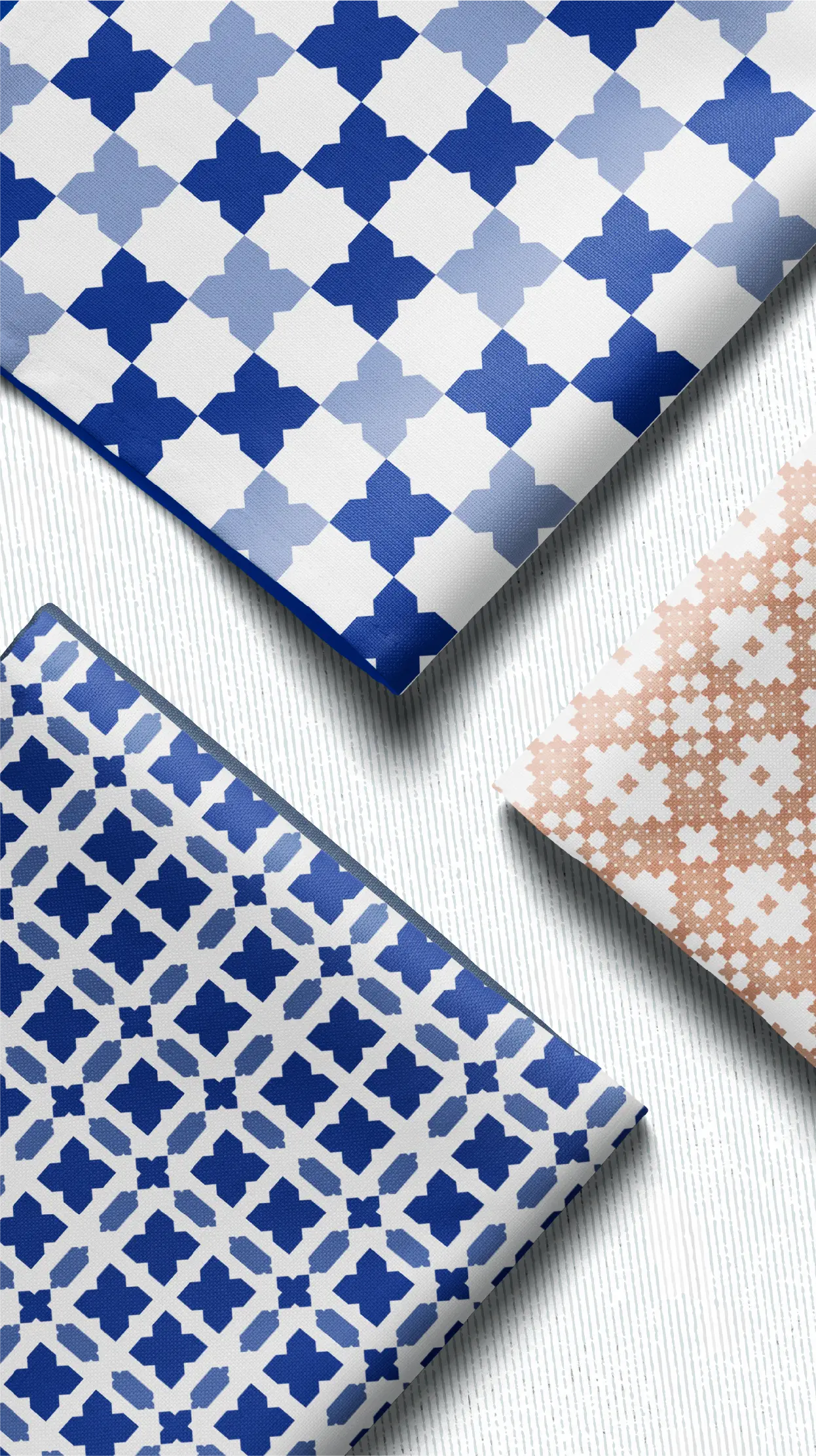
The turtle’s form is derived from the brand’s Persian/Arabic wordmark, “ورگ” (WARAG). The calligraphy curves and layers to outline the turtle’s head, shell, and flippers, merging typography and symbol into one unified shape. Our design process initiated with in-depth research into the visual motifs of Sistan and Baluchestan, including direct conversations with regional artisans to better understand the region’s aesthetic language and cultural details. Two regional elements inform this design: the soft, layered swirls of local dairy and culinary products, seen in the letterforms’ curves, and the detailed woven textures of traditional Baluchi textiles.
These influences are reflected in the shell’s layered, rhythmic strokes.
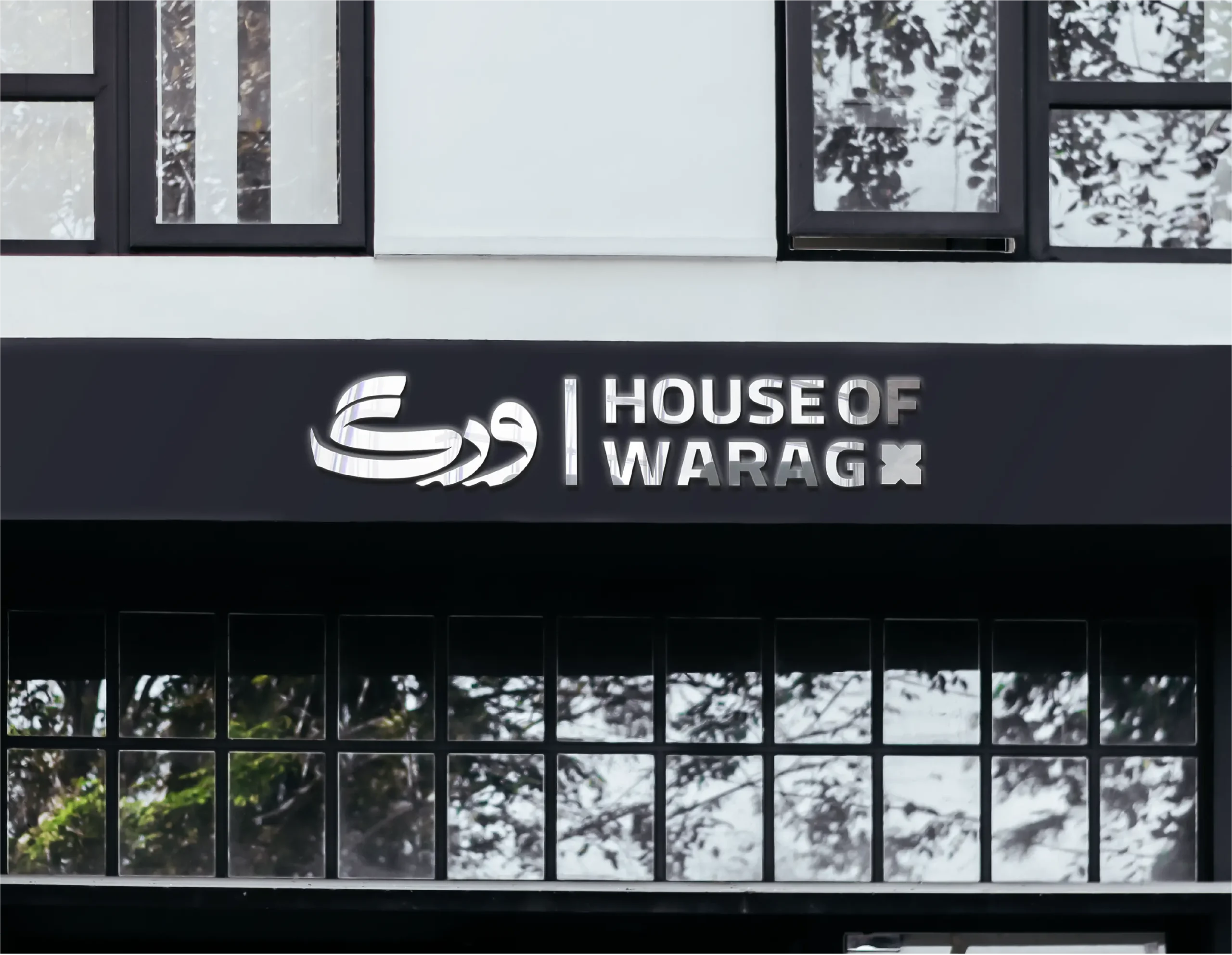
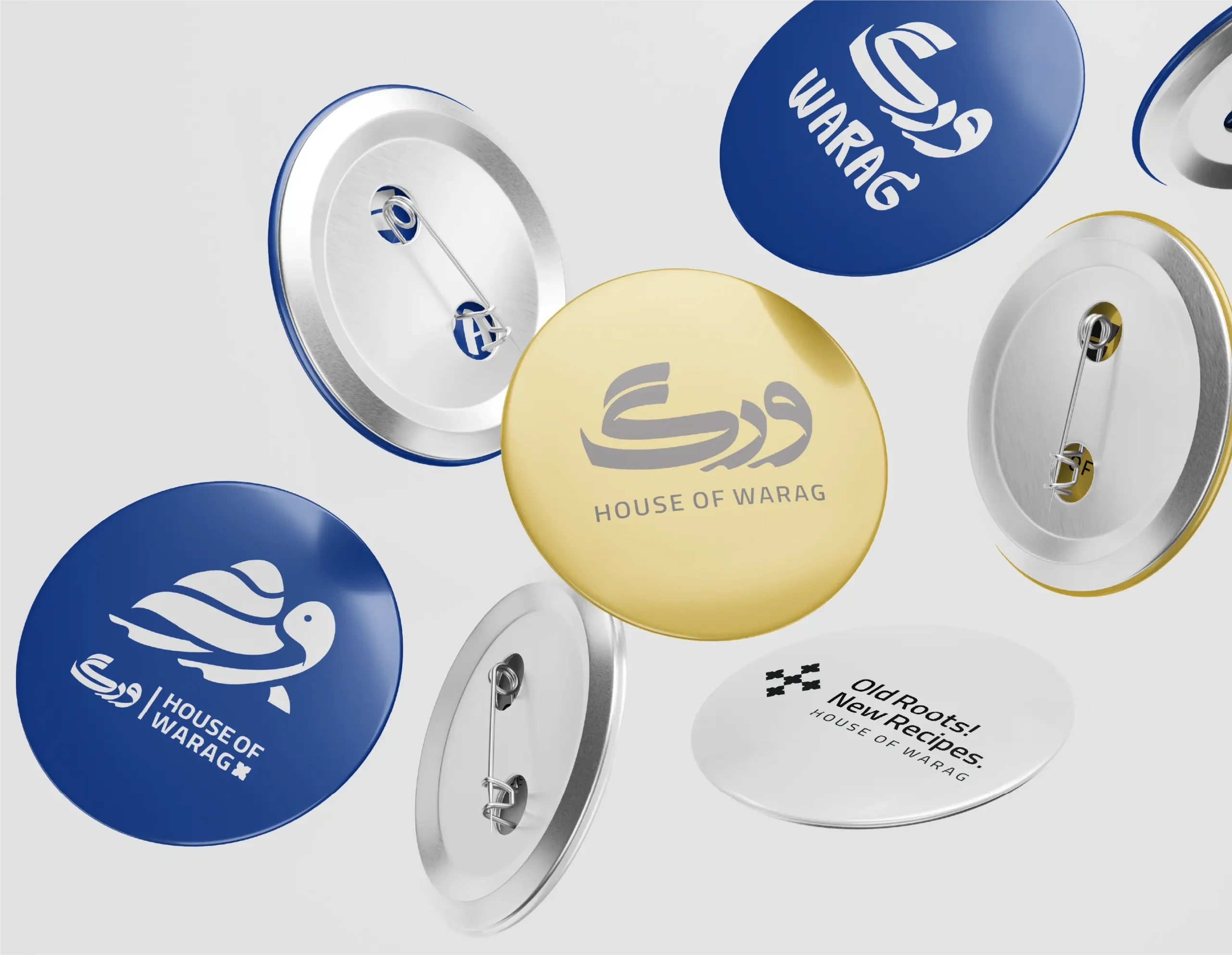
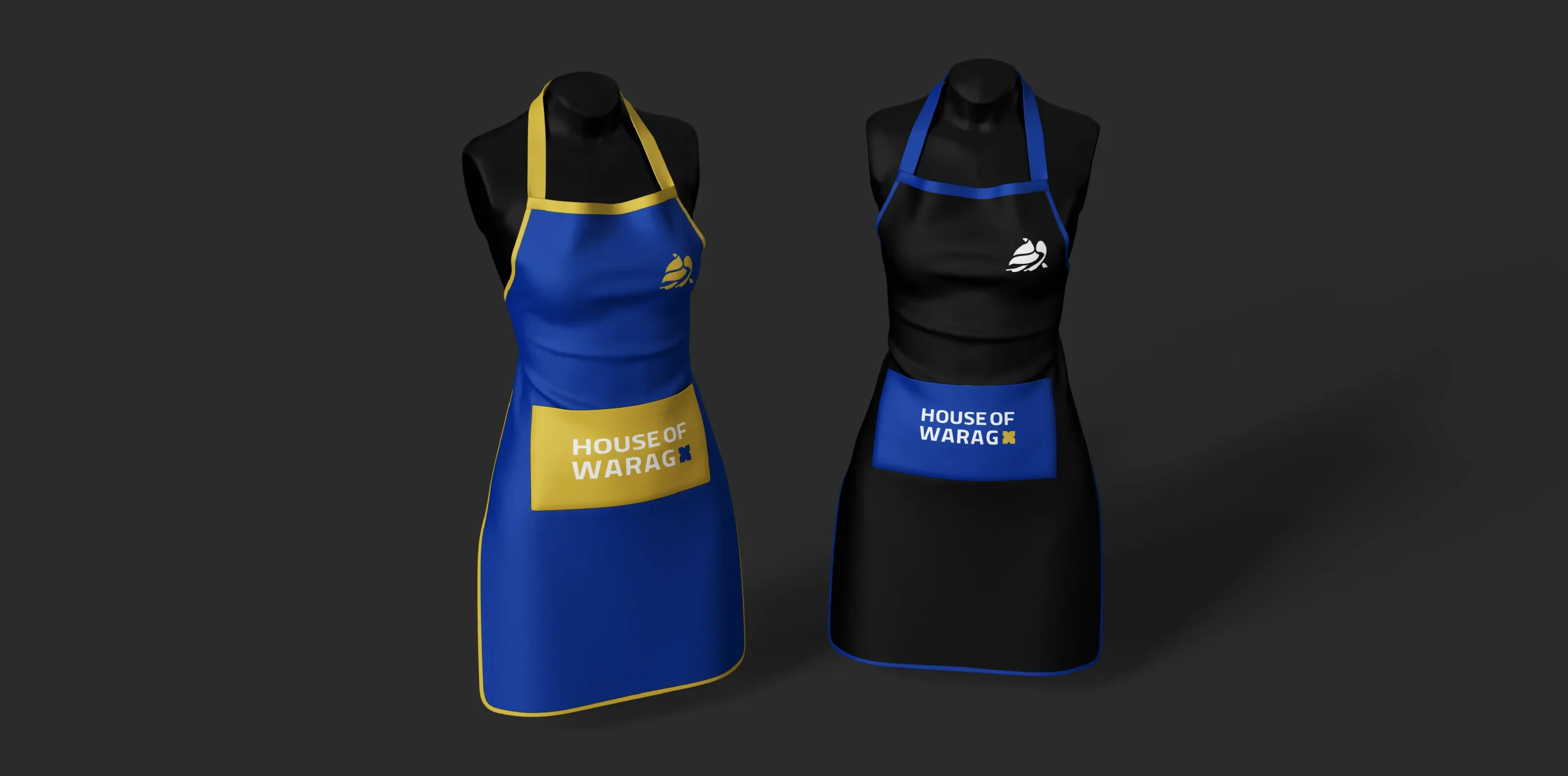
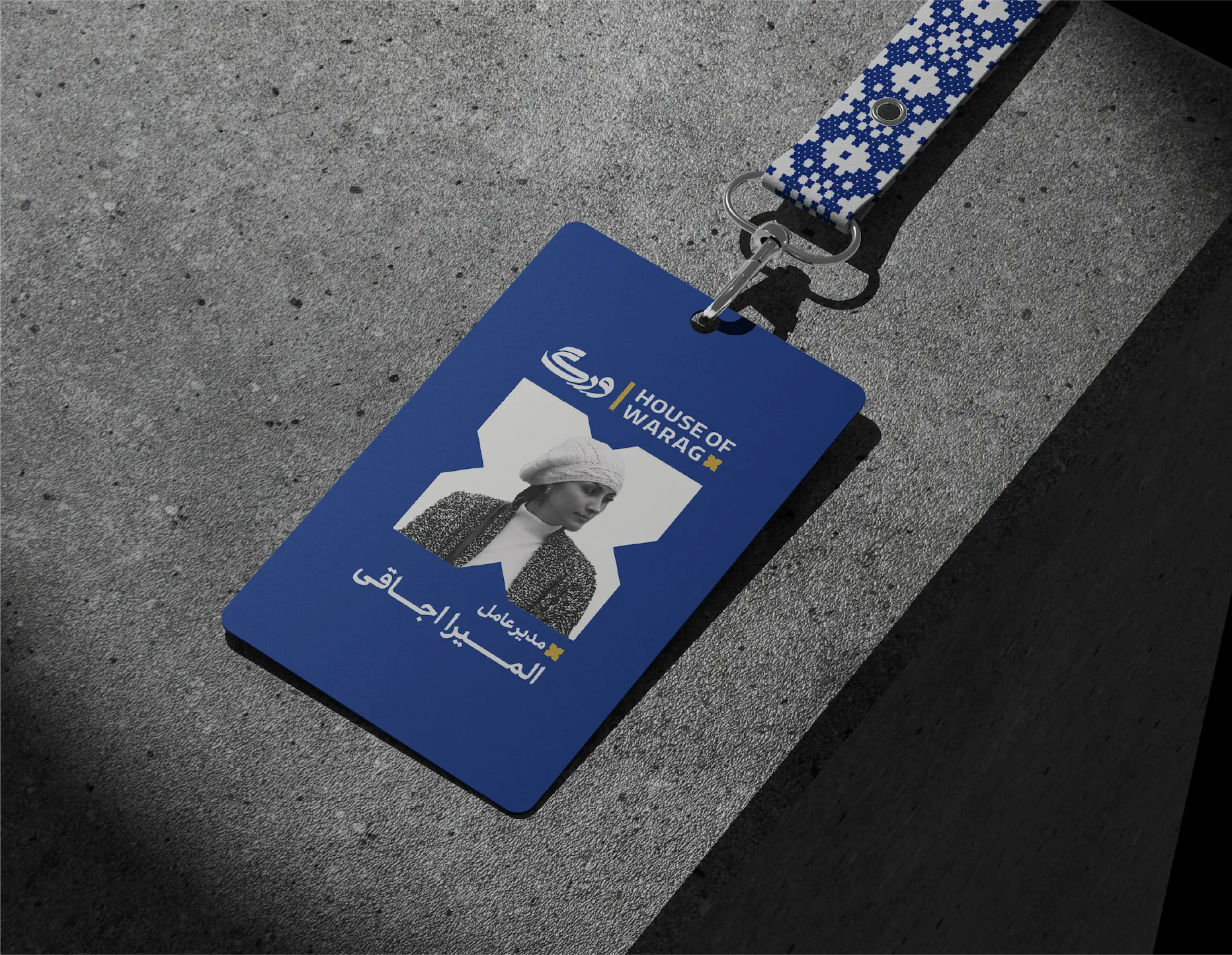
The result is a mark firmly established in place, expressing the taste, craft, and living heritage of Sistan and Baluchestan in a single silhouette. It also quietly honors a species whose survival is as fragile as the traditions the brand aims to preserve. The logo is designed to fit perfectly across a variety of applications, from packaging and product labels to the brand’s website, social media, and retail signage. This flexibility guarantees the logo’s impact and message are consistently experienced by customers at every touchpoint.




Team
Art Director & Brand Strategist: Taha Zaker
Logo Designer: Tanin Amin
Graphic Designers: Tanin Amin, Yousef Alibaba
Visual Identity: Tanin Amin
Motion Designer: Salman Arbaboon